Where were claims at this point in the last cycle?
To understand the likelihood of the US Federal Reserve’s tapering timetable being accelerated, I believe we have to understand how quickly the US employment market improves relative to expectations. That’s because the Fed’s unstated bias in its dual mandate is toward employment over inflation given the talk of a K-shaped recovery and income and wealth inequality. So, let’s look at how jobless claims tracked at similar points in previous post 1982 jobs cycles.
Why these comparables
The reason I want to circumscribe the dataset to post-1982 recoveries is twofold. First, it’s because the post-1982 recoveries have all been ‘jobless’, i.e. slow to return to trend, starting with the 1990-91 recession. And secondly, they have all occurred in under the same rate-targeting fiat currency monetary regime. The Fed is likely to view these outcomes as baselines in their expectation for a return to normal.
Finally, I am also using the jobless claims data sets because they are the best real-time jobs ‘flow’ dataset we have. And outside of the pandemic seasonal adjustment problem we had last year, it has been reliable in terms of ‘flow’ i.e. directionality.
Charting the data
I am going to do this via tables rather than visual charts because it will be hard to tease out the nuances given the order of magnitude scale change the lockdown created. I will also overlook year-over year numbers because of the scale change causing massive distortions. Normally, I like to see year over year changes as a proxy for income flow changes. But, last week, for example, we saw a 1.8 million initial claim change from the year-ago level. The lockdown effectively renders that number meaningless in terms of understanding what that means for wage income flows.
Now, let’s assume we are one year into this recovery with the lockdowns all ending by May of 2020. That’s a contentious issue since the NBER hasn’t dated the recession end yet. But I want to use this post lockdown date to see how high claims were at comparable periods i.e. one year into recoveries in previous business cycles.
Recoveries began March 1991, November 2001 and June 2009. So The dates that compare are March 1992, November 2002 and June 2010. Let’s see what the claims data look like at those dates compared to today. Note the numbers highlighted in yellow.
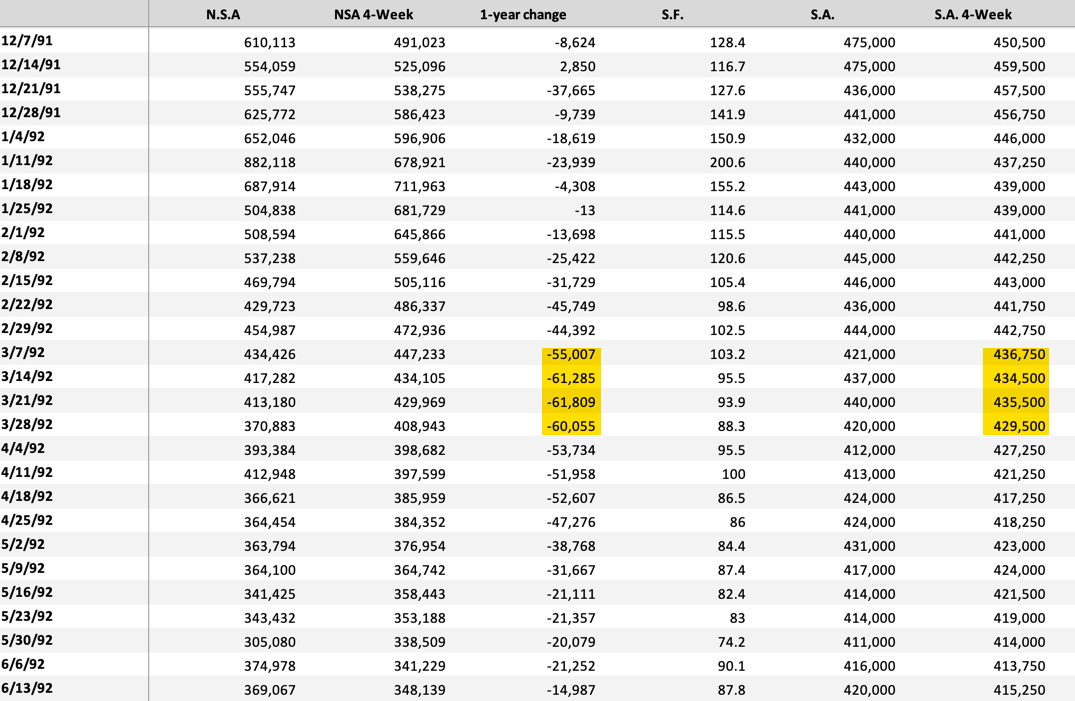
March 1992 data
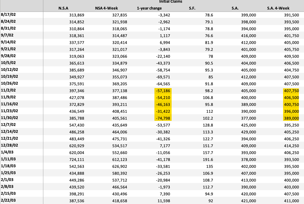
November 2002 data
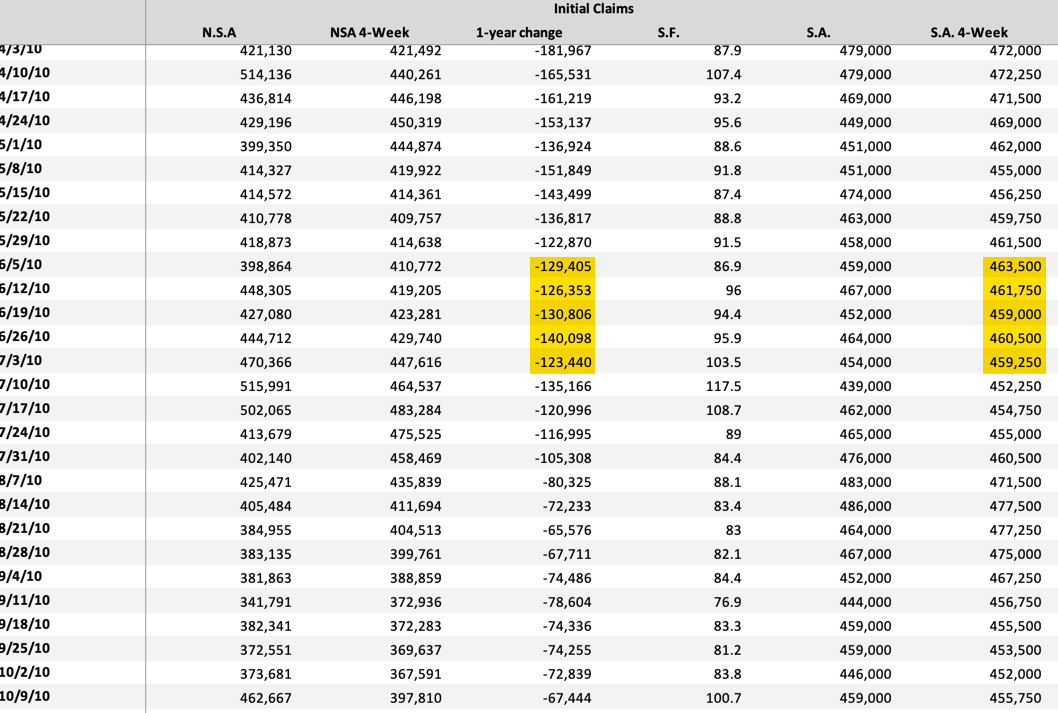
June 2010 data
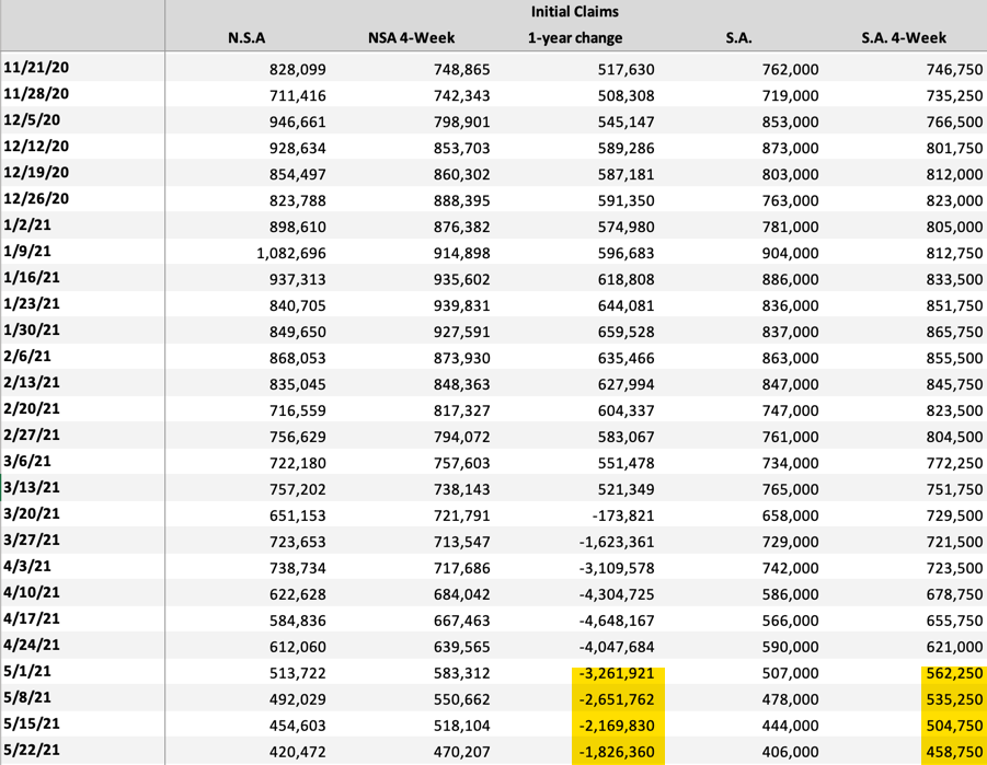
May 2021 data
My view
First, the year-over-year numbers are meaningless both because of the magnitude of unemployment during the lockdowns and because of government transfers making the income flow channel difficult to read.
Second, we were in the 400s at this point in each of the last three cycles. And I told you last year that a “steady-state post-recessionary economy is associated with maybe 400,000 initial claims, about half [of the then prevailing] levels.” And today, we’re just getting down from those levels.
Overall, that says we are slightly behind track relative to the last three business cycles. And so, absent government deficits and transfer payments, the hit to income from wage income outflows that initial claims represent would retard growth.
If you look at the trend in 2010, claims remained elevated. And so it is understandable growth was more muted than in 1992 and 2003. What we want to see is claims falling below 400,000 to be on par with those previous two cycles.
Overall, if claims fall below 400,000 soon, I would expect upside surprises in job growth and an acceleration of the timetable for tapering asset purchases, with MBS the asset most likely to be tapered most. From a signalling perspective, this could put upward pressure on mortgage rates by the Fall.
Comments are closed.