People are finally realizing that the jobs picture has weakened
It took the dramatic downshift in non-farm payrolls today for people to wake up to the drip-drip of weak jobs data coming out of the US. This put the equity market into a funk and caused bond yields to sink back to where they were on February 27th before the economic bulls took over. The question now is not whether there has been slowing. The question is whether that slowing will continue. Quick thoughts below
By the way, this is one of the occasional free Credit Writedowns posts I write. If you like what you read please consider subscribing to the weekday newsletter. Plus, we are running a limited promotion.
The jobs report
Since I am writing this at the end of the business day instead of the morning, I am going to gloss over the numbers and get to the analysis as quickly as possible. The headline numbers were 3.8% for unemployment and a 20,000 add in non-farm payrolls. The 20,000 print on non-farm payrolls was the weakest number in 17 months and startlingly below the expected 180,000 figure. On the other hand, the unemployment rate dropped to 3.8%. It was the really weak 20,000 figure that got people’s attention. But I don’t pay attention to any of these numbers.
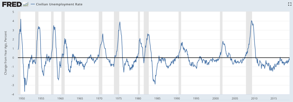
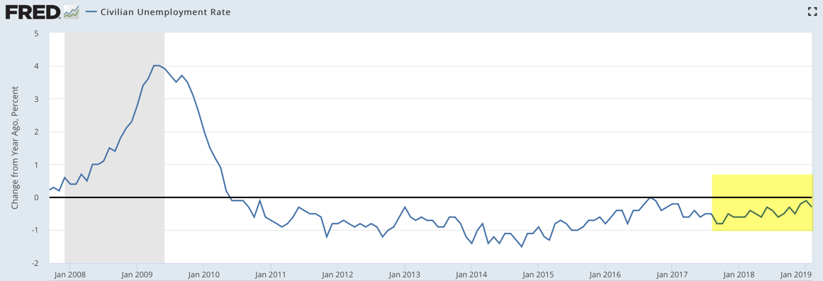
Instead, what you want to look at is what I call the deltas, the change figures. And ironically, here, the numbers were good. For example, look at the year-on-year change in the unemployment rate.


Source: St. Louis Fed
We’re looking at the change in the unemployment rate, instead of the unemployment rate here. You can see the number looked good. While unemployment is a lagging indicator, the change in the unemployment rate coincides with or leads recessions. The part in yellow shows the year-on-year comparisons weakening since September 2017 when the unemployment rate had dropped a prodigious 0.8% in the previous year. The figure for February was at a 0.3% drop, down from a 0.1% drop.
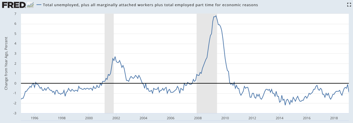
The same thing goes with the broader U-6 level of unemployment too.

The contour of the change is the same, with February showing a sharp reversal in year-over-year numbers, with U-6 down now 0.9% over the last year. That’s a good number.
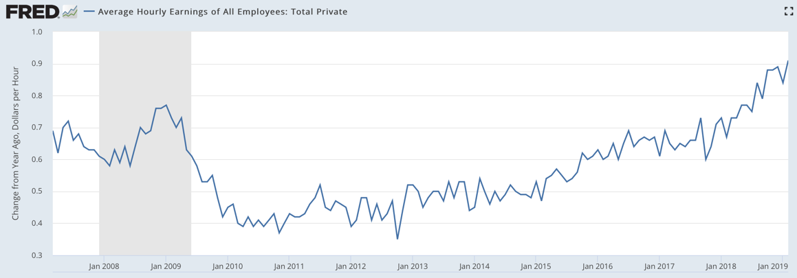
Finally, there are wages, where the year-on-year change is at decade highs.

In short, the employment report was a lot more bullish than the headline number.
Here’s the Context
Perhaps, the business survey data series is just playing catch-up because both the household survey and the weekly jobless claims series have shown weakness in the past couple of months. Jobless claims were down on a year-over-year basis again this past week. And that’s a real-time indicator of weakness in the employment market. So, we’re not out of the woods here.
My guess is that the figures have been distorted by the government shutdown. And we won’t get a reliable sense of direction of travel until April or May. The same goes with the GDP reports as well. Of course, that means the Fed will be on hold, though its not clear if they are simply done hiking for good.
If capital expenditure rolls over as David Rosenberg has been saying, then the positive blip in change data from this report will fade. And the more worrisome tone of the last couple of reports will return. However, if the Goldman troughing prediction is where we are headed, I expect the 20,000 print on the NFP number to be the outlier.
Overall, I don’t see this as a bad report. Indeed, on many levels, I find it encouraging despite the headline figure of 20,000 jobs. Nevertheless, the jobs picture has weakened somewhat. And todays shock headline figure finally makes people understand this.
So, we are at a bit of a crossroads here. It’s still not clear whether we can truly get re-acceleration 10 years into this business cycle or whether the next downturn is just around the corner. At a minimum, the Fed is on hold. And that will give the economy some breathing room.
Comments are closed.