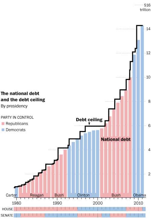
Chart of the day: Debt Ceilings – A historical perspective
This comes from the Washington post:
Since 1980, the debt ceiling has been raised 39 times. It was raised 17 times under Ronald Reagan, four times under Bill Clinton and seven times under George W. Bush. Congress is currently in a contentious debate with the White House on whether to raise the ceiling by the Aug. 2 deadline, which would make the fourth raise under Obama.
Source: Who raised the debt ceiling? – Washington Post
We’re now up above $14 trillion (including money held by federal agencies). That’s up from $830 billion the last time a debt ceiling showdown went down to the wire in 1979. In case you were wondering what a trillion dollars looks like, here you go:


Source: What does one TRILLION dollars look like? – PageTutor


This shows Republicans in control of the House during the Reagan administration. Nope.
this shows us all what this is really about…race and politics. Bush/Reagan in office…sure raise the debt ceiling…why not? What’s wrong with you!!?!?!
Obama/Clinton in office…raise the debt ceiling?!?!?! Who the *&^* do you think you are!?!?! You reckless, irresponsible, diabolical man you are, Mr. President, with all due respect sir. No we refuse to raise the debt ceiling.
Give me a freaking break…these guys are all assholes, including Obama, who only jumps and shimeys to the right in the spirit of “compromise” while the right only gets more and more insanely extreme. Good day America!!
I was looking all over for a chart just like this but unfortunately the information is not accurate. We all know that Obama had a Democrat controlled house with Nancy Pelosi at the helm but your chart shows it in Republican hands. Sorry, that’s wrong or Obama-care would not have passed. Mike in his comment above also had more errors. The format of the chart is wonderful, too bad the data is wrong. Other than correction of the inaccurate data, having the chart expanded to the 60 would be a great addition.