Chart comparisons to an earlier period of accommodative US monetary policy
By Sober Look
Here is an observation. The last couple of years show some interesting similarities to the period ending in early 2005. The reason for such a comparison is that then, just as now the Fed began to gradually exit its highly accommodative policy.
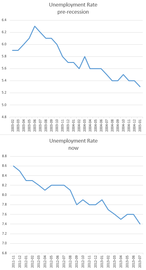
Both periods show similar trends in the unemployment rate, although the absolute levels are quite different. That, at least in theory, is usually the rationale to consider exiting stimulus.
Similarly housing prices show an upward momentum during both periods. Obviously the speculative fervor of the pre-recession housing market is (supposedly) not present in the current environment.

The Fed’s stimulus of course came in different forms for the two periods. In the pre-recession era, the Fed used the overnight rate to provide accommodation, which dipped down to 1% at the peak of the stimulus. In the current environment – with the overnight rates effectively at zero – the stimulus is in the form of longer-term rates which are adjusted via securities purchases. The chart below shows the stimulus (blue) and the start of the exit for both periods. The trends in the “risky” assets are quite similar during those periods.
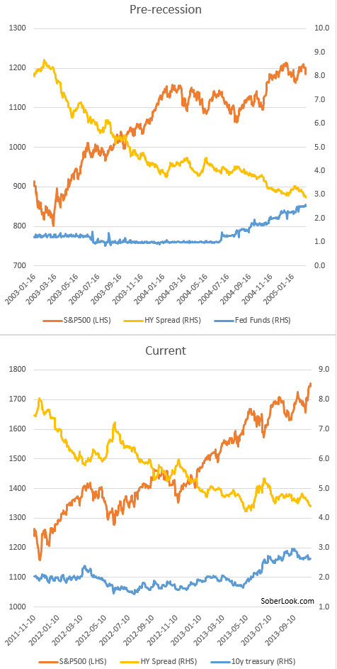
What does this say about the current environment? The accommodative period that started with the burst of the tech bubble and ended in 2005 may have been overdone, igniting the housing bubble through artificially low rates (see post from 2009). The exit did not end well, as rising rates sent shock waves through the overleveraged housing market. The current stimulus cycle is of course quite different. Nevertheless the lesson here is that the longer the accommodation period the more dangerous the exit (as we already saw with the emerging markets rout).
Comments are closed.