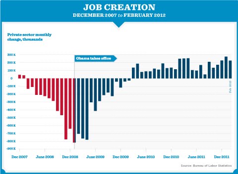
This chart from President Obama’s pinterest account is pretty interesting (pointer to Marc Chandler).
Here’s what I see: job destruction during a cyclical downturn followed by massive job destruction after the Lehman failure followed by a steady climb toward tepid job creation. The narrative that seems to support this chart is that we had a cyclical downturn in 2008 that aggressively worsened after the Lehman failure. Job destruction on a massive scale lasted for half a year before the situation could be reversed.
How do you spin this negatively against Obama? I’m not sure you can but you could try to map this chart against other recessions and argue job creation was slower. But you’d need the have data that supported that conclusion.
Objectively speaking, I see this as a very strong chart for Obama. Thoughts?
Update: The first answers I got regarding pushback are:
- What kinds of jobs were created, in which sectors and what pay level compared to the median?
- Why private sector jobs only? What happens when you add in total job creation?
If I get other questions, I will add.